DIY: How to build a chic flower bouquet for your graduation photos

Floral Design for Beginners
Flowers are always a good idea. There’s something incredibly chic about adding a fresh, living element to your final look. You don’t have to go for an overly romantic or girly concept to enjoy this prop!
This is a topic I personally love. I truly enjoyed researching and putting together all this information to help you create (or shop for) a chic floral arrangement.
Let’s start with a few key points to keep in mind:
Conceptualizing the design.
Choosing your ingredients.
Determining your color palette.
Placing the greenery and florals in the design.
Conceptualizing the design
Think of this part as your mood board moment. This is where you put your idea into words or images.
Look for lots of references , but here’s the key: try to narrow your style down to one or two keywords. That will make your search so much easier and more intentional.
For example:
Are you going for something light, airy, and whimsical?
Or do you want a full, lush, garden-style bouquet?
Once you identify your keywords, you’ll start recognizing what you’re naturally drawn to. It becomes much easier to understand your taste, and to communicate it when you’re ready to create or purchase your arrangement.
2. Choosing your ingredients
Personally, this is the step that makes me the most nervous. There are so many filler options and so many possible “main characters” that it can feel overwhelming.
But don’t worry — I created this little guide to help you understand the main elements of a floral arrangement, plus a few examples:
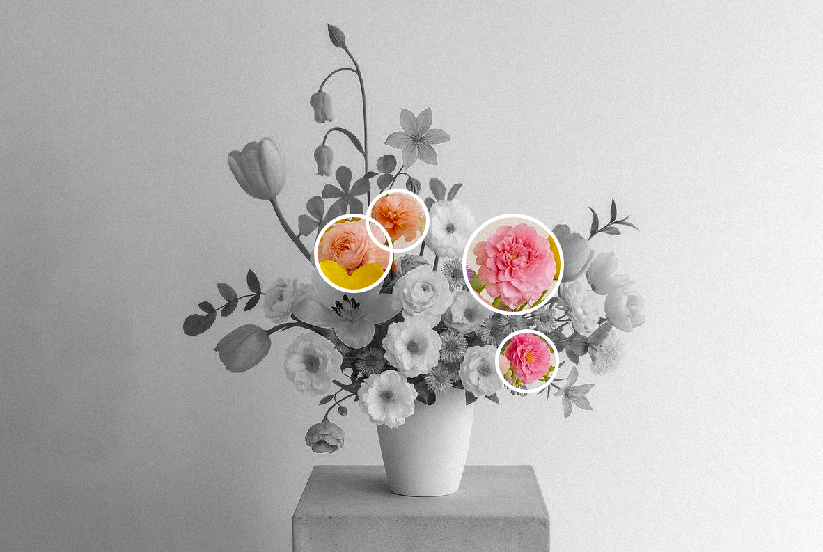
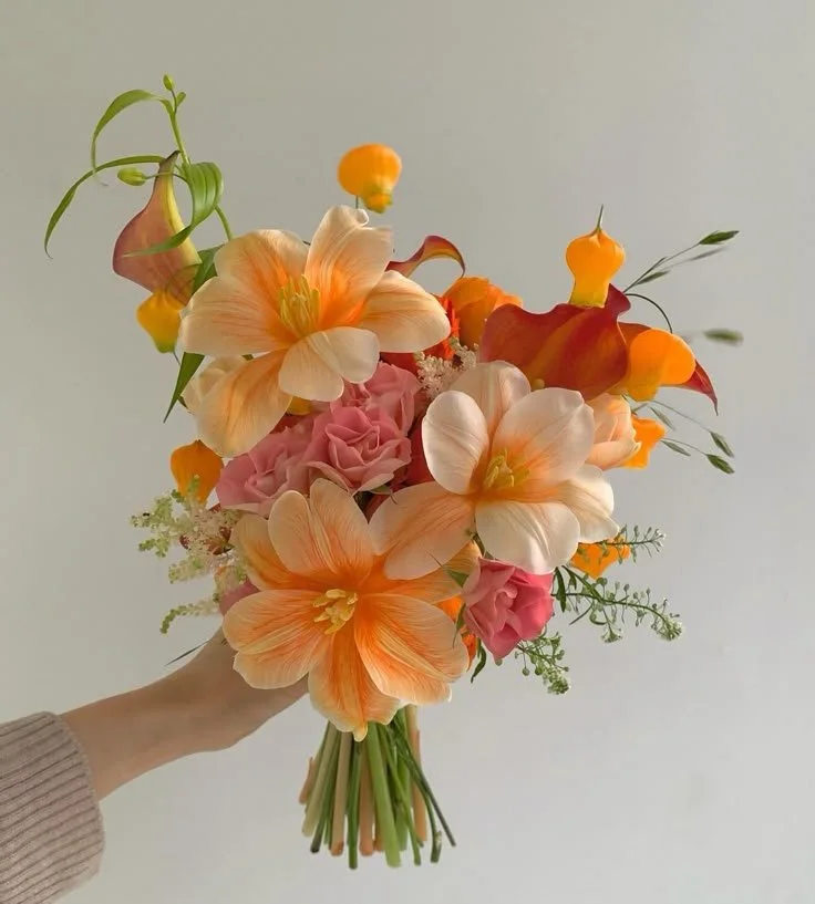
Focal Flowers
These are the stars of the show.
Usually larger, rounder blooms that carry strong visual weight.
Examples: garden roses, peonies, dahlias.
They’re the main character energy of your bouquet.
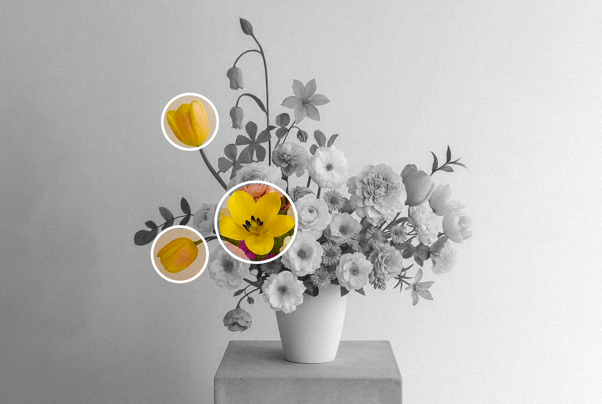
Line Flowers
These are the taller flowers with clean stems and minimal leaves.
Examples: foxglove, delphinium, snapdragons.
You don’t need many — just a few touches to create height, dimension, and movement.
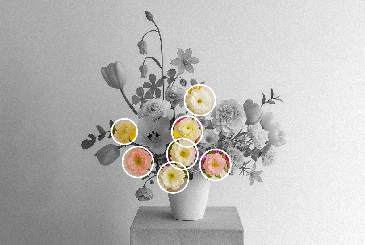
Filler Flowers
These are the supporting cast. Smaller blooms that help connect everything together.
They can be smaller flowers like spray roses and carnations, or even textured elements like hypericum berries or privet.
They add softness and fullness without stealing the spotlight.
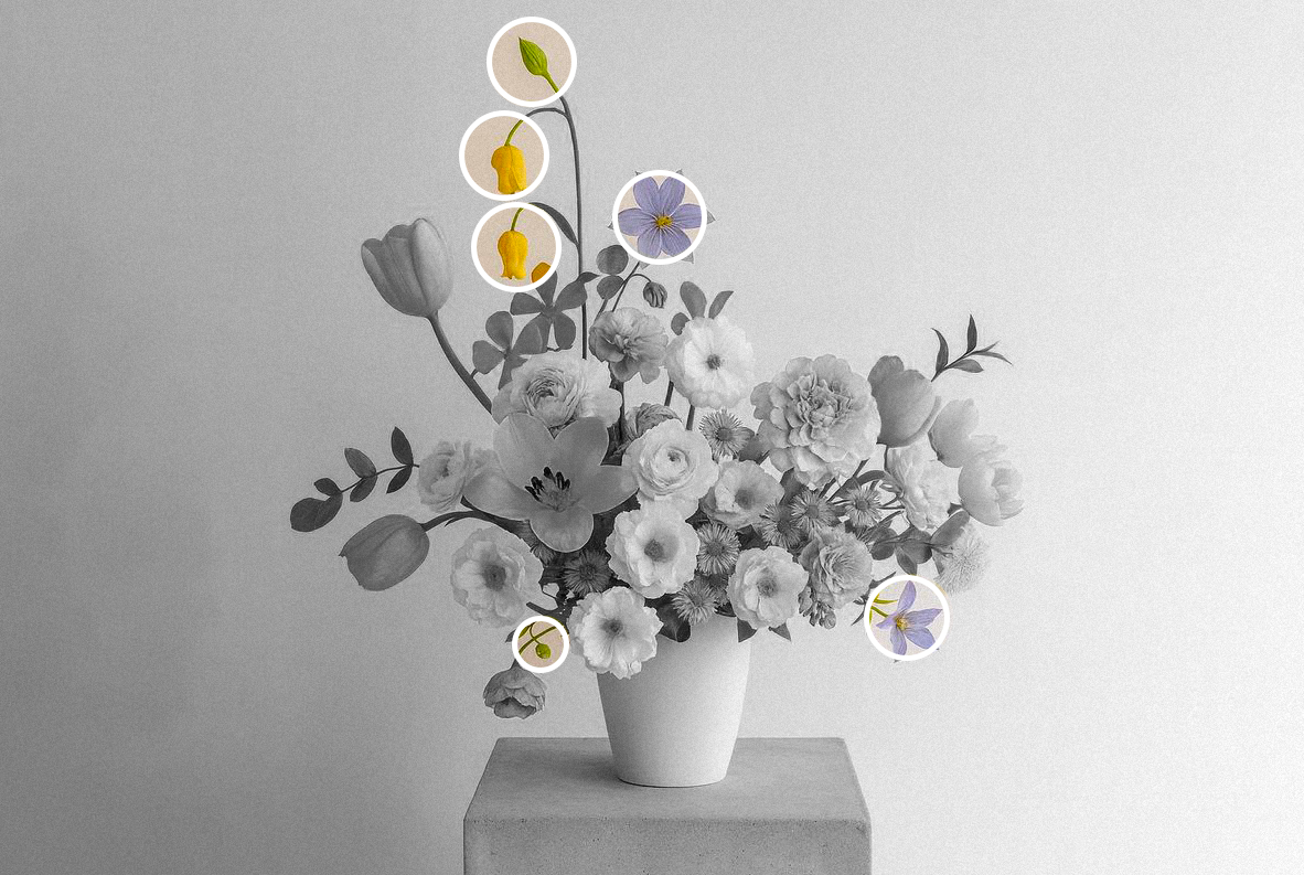
Detail Flowers
These are the tiniest, most delicate blooms — sometimes even small buds.
Think light, airy, almost whimsical.
Examples: sweet peas, butterfly ranunculus, cosmos.
They add that subtle, romantic finish.
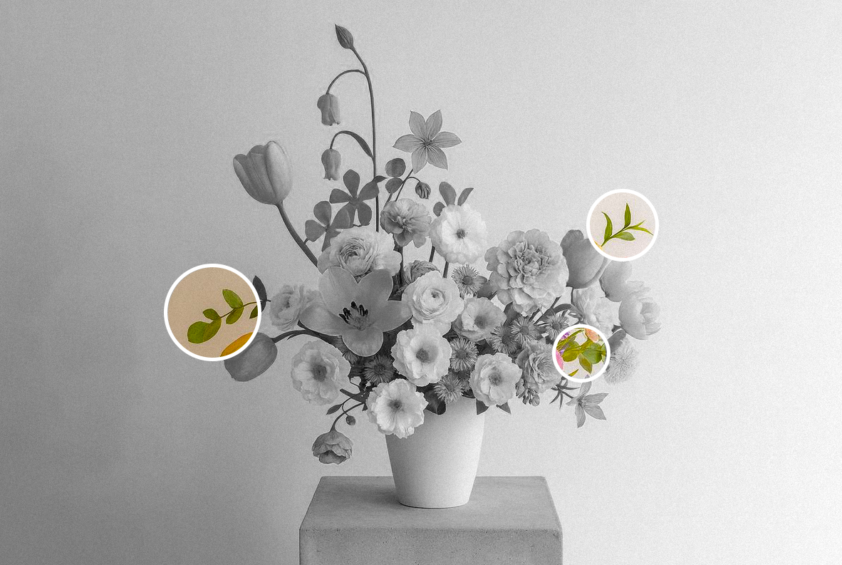
Greenery
And now, the real foundation.
An arrangement rarely looks natural without greenery. These leaves add structure, body, and balance. I see them as the frame of the final piece.
There are so many shapes, shades, and textures to choose from.
Examples: eucalyptus, Italian ruscus, leather leaf, ferns, dusty miller, and myrtle.
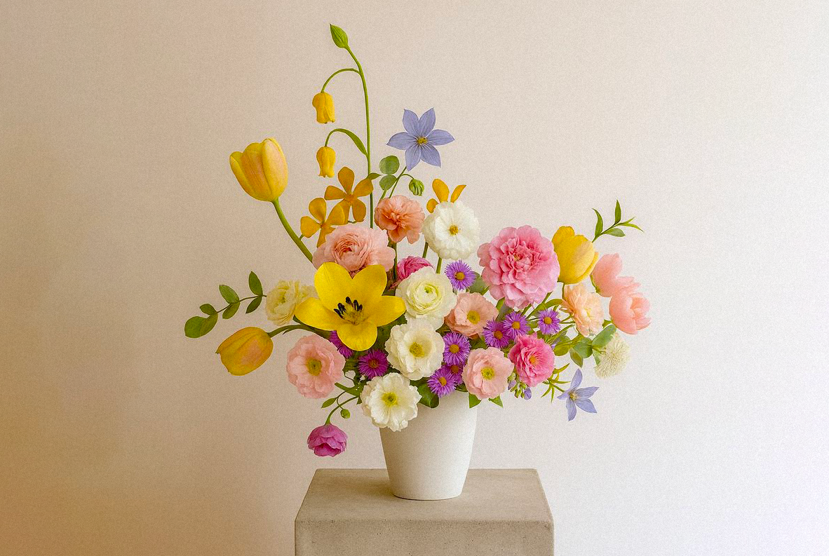
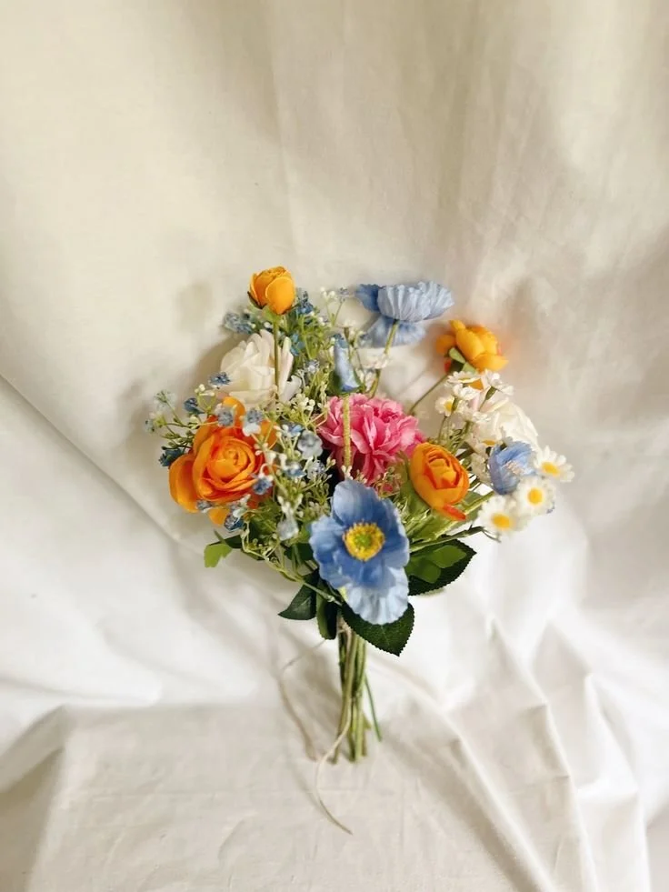
3.Determining your color palette.
Now that we have a better understanding of the “characters” we need in our arrangement, we can start thinking about the color palette.
As a photographer, anything related to color is my favorite topic.
Let’s divide this into a few categories:
Monochromatic
This means staying within one single color family.
But don’t worry — it’s not restrictive at all. You can play with different tones and hues within the same color of flowers.Using the Wrapping color in your favor can also create a fun piece.
Analogous
These are colors that sit next to each other on the color wheel.
They naturally blend well together and create a harmonious, effortless feel. For example: peach, coral, and soft pink — or lavender, periwinkle, and baby blue.
Very dreamy, very easy on the eyes.
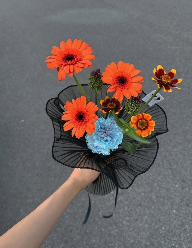
Complementary
Now imagine the color wheel again — these are colors that sit opposite each other.
For example: orange and blue.
This palette is beautiful because it creates contrast while still feeling balanced. You can elevate a soft pink and peach bouquet with a touch of pale blue or lilac. Or use pale lime-green foliage to balance deeper purples and reds.
It feels intentional and dynamic.
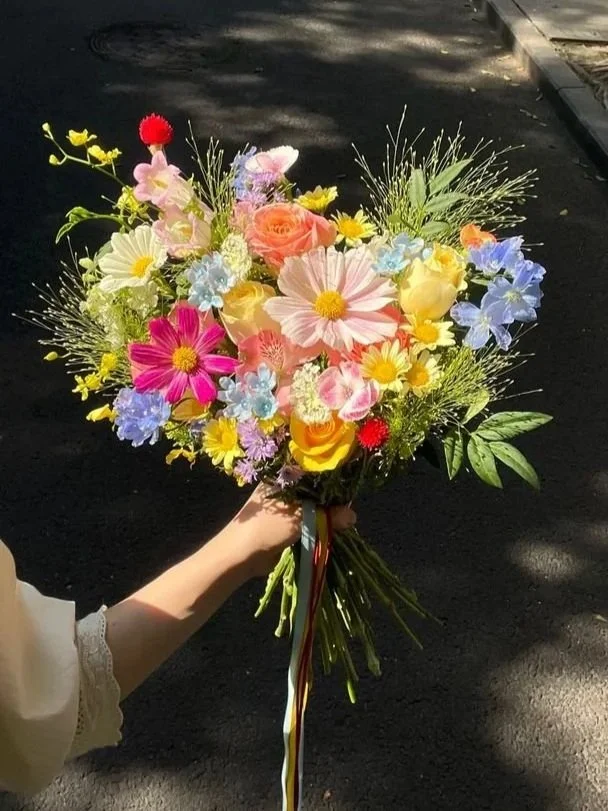
Color Saturation
This one is so fun , and in my opinion, the most natural.
I picture a bouquet you made yourself after picking flowers in a meadow. It feels organic and free.
Here, you can mix different colors, but keep them within the same intensity level.
Think:
Soft pastels
Deep jewel tones
Muted shades
Muddy, earthy colors
The key is consistency in depth and saturation, even if the hues are different.
4.Placing the greenery and florals in the design.
Now it’s time to put everything together. According to my research, we should build the bouquet from the outside in.
1) Start with Greenery
Begin with your greenery layer.
Important note: this green base not only adds structure and shape, it also helps hide any mechanics or support elements you may be using. Think of it as both the frame and the camouflage.
2) Add Line Flowers
If you’re using line flowers, place them after the greenery layer.
Remember, these are your dramatic ones — the rebels of the bouquet. They add height, movement, and dimension by extending slightly beyond the main shape.
You don’t need many. Just enough to create interest.
3) Big to Small
Now that you have your base, start adding your larger, heavier blooms — your focal flowers.
Once those are placed, work around them and begin incorporating your filler flowers to soften transitions and connect everything together.
This is where the bouquet starts feeling full and intentional.
4) Finish with Detail Flowers
Finally, add your detail flowers.
These are the tiny touches of color and air placed wherever the arrangement needs a little lift. They bring lightness and that effortless, organic feel.
Bonus tips!
The bouquet is finished… but is it really?
This is where I think the biggest difference appears, the difference between a thoughtfully styled bouquet and one of those supermarket arrangements that never quite feel “done.”
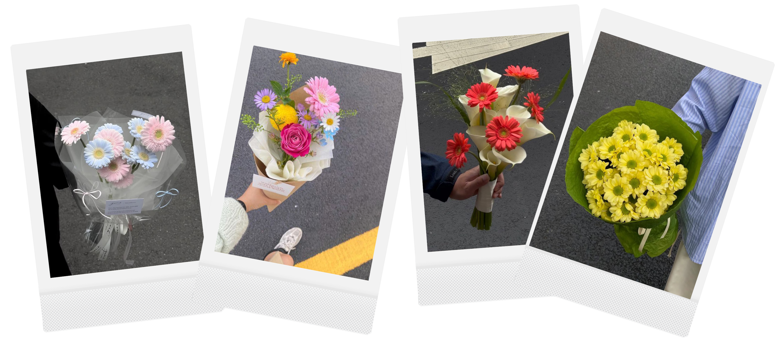
I’m not saying plastic wrap can’t look cool (I have the proof below that it CAN!), but is about the intention of the elements.
But if we’re creating bouquets that feel fresh, playful, and personal, here are a few extra elements that can elevate your arrangement instantly:
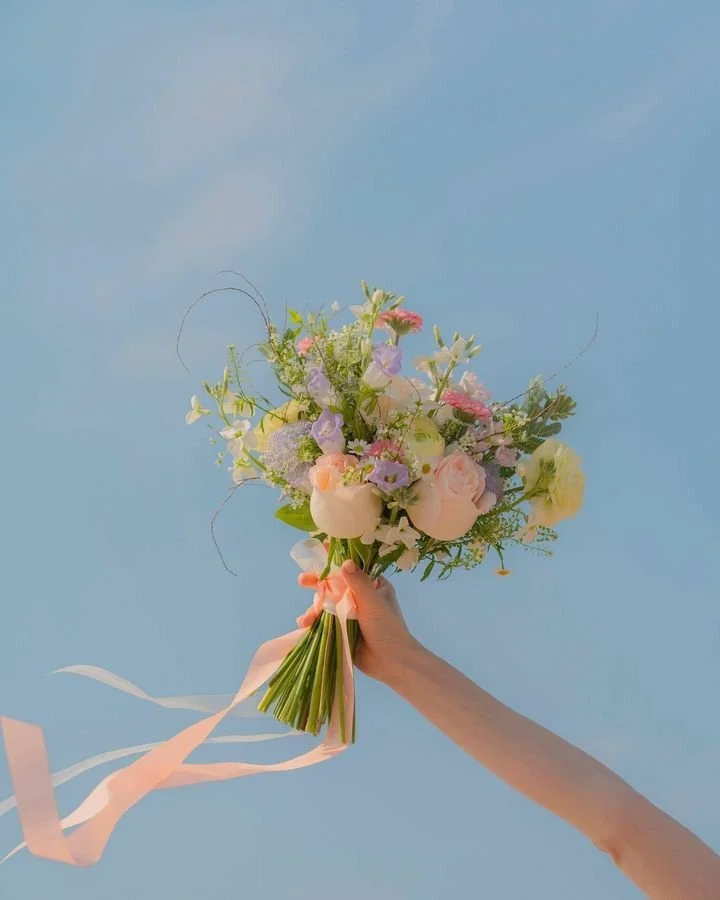
Ribbons
Tie the bouquet with a long ribbon and let it flow in the photos — I love that movement.
You can also use a fabric strip instead of a traditional ribbon. I personally love something slightly thicker with soft texture, like cotton or linen. It feels organic and adds depth without overpowering the flowers.
Twine
A thin piece of twine gives such a handmade, organic touch.
It tells a story: I made this myself.
Like if you gathered the flowers, arranged them in your studio, and found this little piece of string in a drawer.
Simple. Honest. Beautiful.
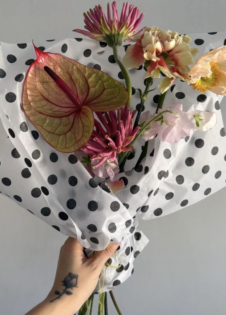
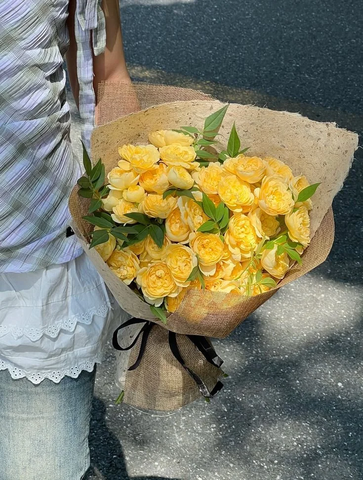
Paper
I love the look of kraft paper or clean white paper, and a new resent obsession… patter paper!
If you want to elevate the look, layer a second paper with a different color or texture — maybe something semi-transparent. That subtle contrast can make everything feel more styled and intentional.
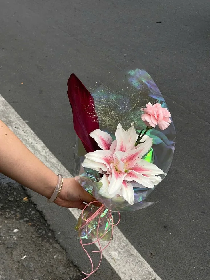
Plantastic!
Told you plastic was also cool.
Some cute holographic, with sparkles or just pain transparent can look really cool and chic.
For me this one is the rockstar of the group.
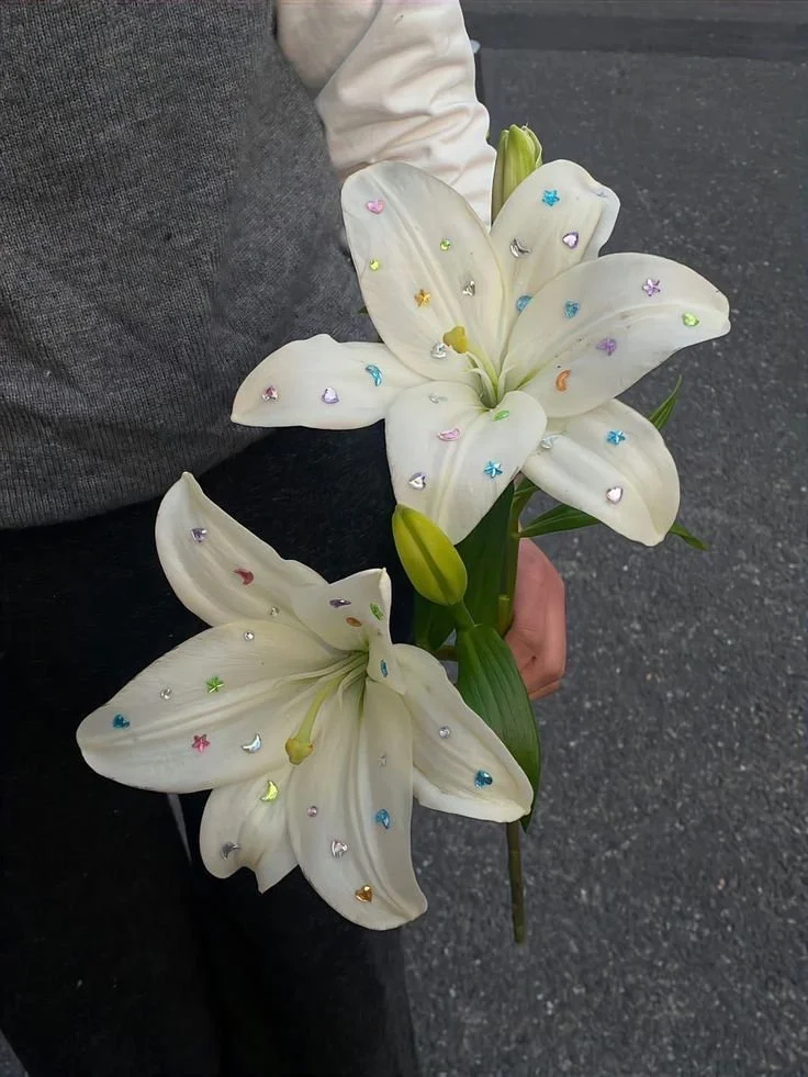
In my Bejeweled-Era
Im Obsessed. Please someone say yes to this bouquet.
This is the definition of FUN and doesn't take much money or time.
Check more of this type of flower-decoration on my Pinterest board!
Its a wrap!
And now, a huge thank you if you made it this far. I know… it’s A LOT of information, but I promise it’s years of research and experience (and extremely valuable, in my opinion).
To keep the inspiration going before your session, here is a special mood board I put together just for you. Click on the folder image bellow to access my Pinterest board and get inspire. Don’t forget to follow for future updates and new board creations!